Beth and I have not even spoken once on the phone throughout this process. It has literally been FB and email communication only, with inspiration and idea exchanges via images and website links. And though (due to the pesky day-job and a big fat holiday in the middle of the process) we have had to deal with some delays, we have arrived at the end (atleast for me) with a beautiful, unique plan with lots of pattern play and texture, of course. She was aware of (and interested in) my aesthetic and my love for unexpected pattern mixes. Although Beth and I have many common likes, she is unique, so it was up to me to make this about the new baby and their family as a reflection of them. Beth loves peach, she loves vintage prints, and is self-proclaimed lover of all-things-granny. I don't know anyone who could pass up the opportunity to bring that to life. Now, don't misinterpret the granny note as bad - she is interested in the past and things used and loved before us and the sweet, delicate motifs that we might have seen in our grandparent's homes (as am I) - and trust me, this momma is one of the most chic, cool, talented (she sings, paints, builds, grows, sews, stitches, cooks!) gals I've ever known. She owns her opinions, while being immensely open - fab combo.
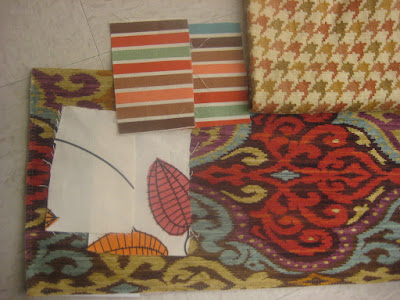
These images depict how we went from here-to-there in a nutshell - inspiration/color palette, second options, and final combinations - and all electronically. And for this instance, Beth is arranging all the labor (I hear she has a very talented mom-in-law), and will quite capably finish the project from here - I've just taken what she loves and what she has, and interpreted it through fabric selection and placement. It was so fun , and I'm thrilled to get back to my roots and my education in Interior Design (one of my original loves) in a new and different way! And as I work on the next steps for Smmidge & Momofandango, I'll be excited to start officially offering this service based on a flat fee per room and some a la carte options (labor, paint, decor etc). So many fun, exciting changes to share with you all very soon!
 |
| Second options to ensure we are going in the right direction - did she want more brightness? No - dots deleted. Did she really want the big bold print? Yes! - put it back! |
 |
| Here we are with the final combo for big elements per her needs (bumpers/floor pillows) |
 |
| Combo with crib sheet option (right). |
 | ||
| We included three crib sheet options that I adore, and that provide a quick way to adjust to the tone of the design. Luggage tags provide direction on placement/uses for each fabric. |
 | ||||||||||||
| Pulling the final yardage together for shipment. And note the fuzzy wonder in lower left - we couldn't resist for a beautiful fuzzy pop on a tiny pillow - it is beyond groovy. |
 |
| Final stack, tied with twine and ready to be wrapped in butcher paper and shipped! |


No comments:
Post a Comment